
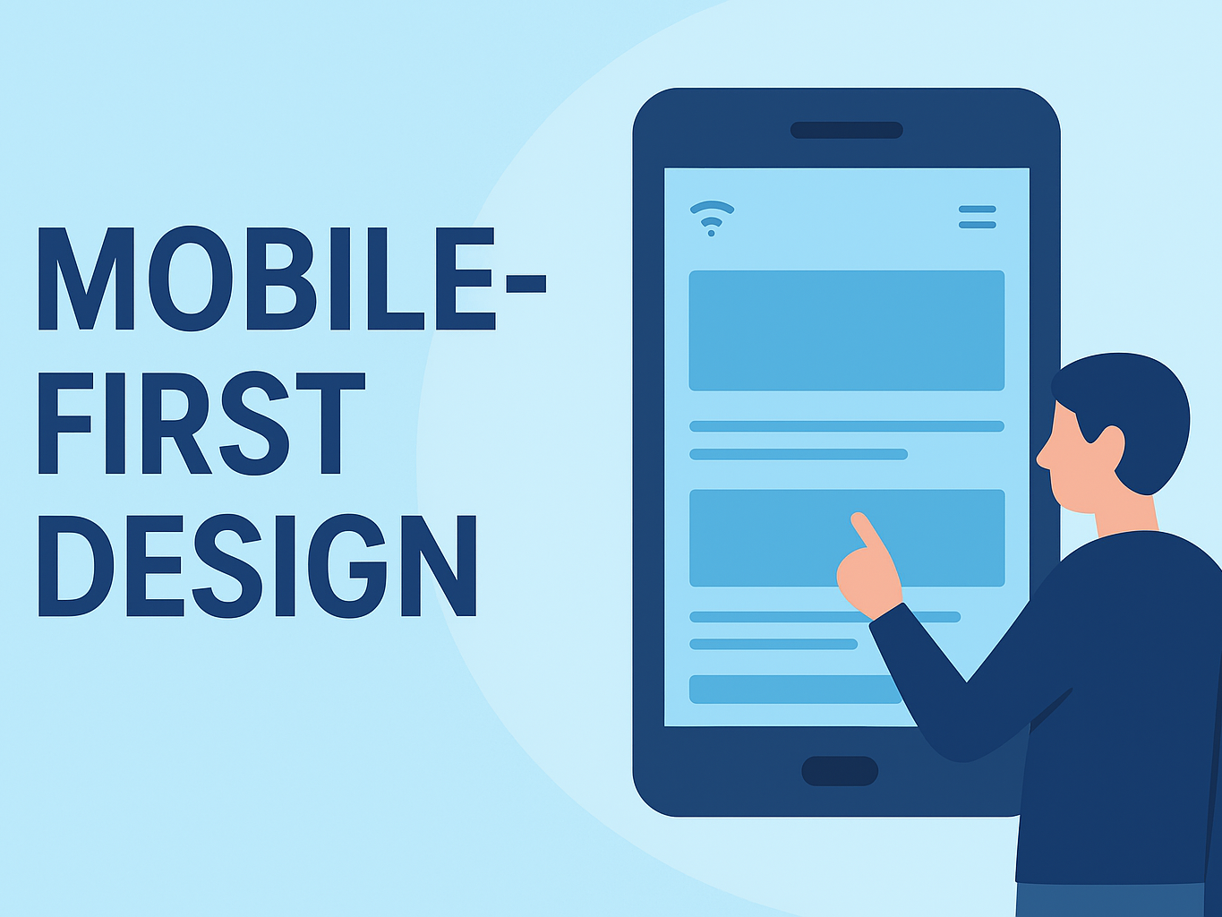
Mobile-First Design: Why It’s Non-Negotiable for Singapore Businesses in 2025
In Singapore’s hyper-connected, always-on world, the smartphone isn’t just a device — it’s the primary gateway to your business. Whether someone is checking your menu, booking a service, or comparing prices on the MRT, chances are they’re doing it on a mobile phone.
Here’s the reality:
If your website isn’t designed with mobile in mind first — not desktop — you’re already losing customers before they even get to your content.
📊 Why Mobile-First Is the New Standard
Google has officially switched to mobile-first indexing, meaning it primarily looks at your mobile site to decide your search ranking. Translation?
Your desktop site could be perfect, but if your mobile version is slow, clunky, or missing key content — your SEO will take a hit.
In Singapore:
-
92% of internet users access the web via mobile (Hootsuite, 2025)
-
Most transactions — from ordering kopi to booking haircuts — start on mobile
-
Customers expect pages to load within 3 seconds, or they’re gone
💡 What Is Mobile-First Design?
Mobile-first design means starting your web design process for small screens first — then scaling up to tablets and desktops.
It’s not just “making the desktop site fit on a phone” (that’s old-school responsive design).
Instead, you:
-
Prioritise the most important content for mobile users
-
Use layouts that are thumb-friendly and easy to read without zooming
-
Optimise load times for slower mobile data connections
-
Keep navigation simple and uncluttered
Think of it as designing the VIP experience for your mobile visitors — and then making it even fancier for larger screens.
✅ Benefits of Going Mobile-First
1. Better User Experience
No more pinching, zooming, or endless scrolling. Visitors can find what they want instantly — whether it’s your menu, pricing, or booking form.
2. Higher Conversions
A frictionless mobile journey means fewer drop-offs, which means more reservations, inquiries, and purchases.
3. Improved SEO Rankings
Google rewards mobile-optimised sites. Faster load speeds and better usability = higher ranking chances.
4. Faster Load Times
Mobile-first forces you to trim the fat — fewer heavy images, cleaner code, and quicker pages.
5. Future-Proofing
With foldables, wearables, and in-car browsers emerging, starting small-screen-first ensures adaptability.
🛠️ Mobile-First Best Practices for Singapore SMEs
| Industry | Example Mobile-First Feature |
|---|---|
| F&B | Sticky “Book Table” button, mobile menu with dish photos |
| Retail & E-Commerce | One-click checkout, mobile wallet integration |
| Education & Tuition | Tap-to-call enrolment hotline, class timetable calendar |
| Beauty & Wellness | WhatsApp booking button, before/after galleries |
| Home Services | Instant quote form, live chat widget |
| Events & Media | Swipeable event schedule, embedded maps |
🔍 How to Check If Your Site Is Mobile-First Ready
-
Test on Your Own Phone – If you need to pinch/zoom to read text — red flag.
-
Run a Google Mobile-Friendly Test – Free tool to check performance.
-
Check Page Speed on Mobile – Use PageSpeed Insights; aim for < 3 seconds.
-
Click Every Button & Link – Are they finger-friendly?
📐 Design Tips for a Mobile-First Website
-
Simplify navigation to 4–5 menu items max
-
Use large, readable fonts (16px+ for body text)
-
Make buttons thumb-friendly (min. 44px height)
-
Keep key actions above the fold (Booking, Shop, Contact)
-
Optimise images with formats like WebP
-
Use sticky CTAs (“Book Now”, “WhatsApp Us”)
📈 The Business Impact
When Singapore SMEs switch to mobile-first:
-
F&B outlets see up to 30% more reservations
-
E-commerce stores cut cart abandonment by 20–25%
-
Service providers report more inbound leads from mobile forms
Better design = better experience = better business.
🚀 The Road Ahead
As 5G becomes standard and mobile shopping grows, your website is no longer a “digital brochure” — it’s your always-open, always-relevant storefront.
In Singapore, where competition is fierce and attention spans are short, the brands that win are those that make it easy for customers to connect — anytime, anywhere, on any device.
Final Thoughts
Mobile-first isn’t a trend. It’s the baseline. Whether you’re revamping your site or building from scratch, start with the screen in your customer’s pocket — not the one on their desk.
In 2025, your customer’s first impression of your brand will most likely happen on a phone.
Make it count.