
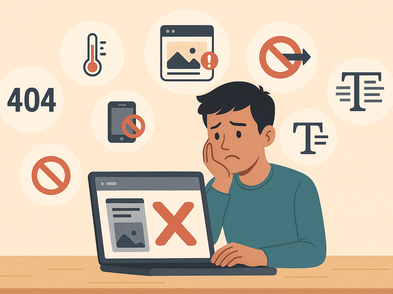
Top 7 Mistakes Businesses Make With Web Design in Singapore
Many Singapore SMEs rush to launch a website, treating it as just a checkbox in their digital journey. But a poorly designed site can cost more than you think — in lost leads, customer frustration, and diminished trust. The truth is, your website isn’t just a digital brochure — it's your 24/7 sales representative, often forming your customer's first impression.
Avoiding these common mistakes can make the difference between a site that converts and one that silently drives visitors away.
1. Not Designing for Mobile (Where Most Users Are)
In Singapore, over 70% of internet traffic comes from mobile devices. Yet many business websites still load poorly on smaller screens — menus are hard to tap, text is unreadable, and images take too long to load.
A mobile-unfriendly site isn’t just frustrating; it’s a dealbreaker. Today’s users expect seamless experiences. If your site feels clunky or difficult to navigate on a phone, they’ll bounce — often straight into the arms of your competitor.
Pro Tip: Prioritise responsive design, test on multiple devices, and think mobile-first — not just mobile-compatible.
2. Ignoring Page Speed (The Silent Conversion Killer)
Speed matters — a lot. Studies show that a 1-second delay in load time can reduce conversions by 7%. In the eyes of your visitor, a slow site feels unprofessional or even untrustworthy.
In Singapore’s fast-paced digital landscape, people expect information instantly. If your site takes too long to load, they won’t wait — they’ll leave.
Beyond user experience, Google’s Core Web Vitals make speed a ranking factor. A slow site doesn’t just lose visitors — it gets buried in search.
What slows websites down: Unoptimised images, bloated themes, too many plugins, and poor hosting.
3. No Clear Call-to-Action (Leaving Visitors Lost)
A visually appealing website still fails if it doesn’t tell users what to do next. Should they book a consultation? Request a quote? Buy now?
Without a clear, prominent call-to-action (CTA), users hesitate — and often leave without doing anything.
A good CTA is like a helpful guide. It nudges visitors toward the next step, reducing friction in the buyer journey.
Examples of effective CTAs:
-
“Get Your Free Quote”
-
“Book a Demo”
-
“Speak to a Consultant Today”
Place them strategically on every page — and make sure they stand out.
4. Neglecting SEO Basics (Missing Out on Free Traffic)
SEO isn’t just about keywords — it’s about making your site discoverable. Yet many SME websites miss the fundamentals:
-
No meta titles or descriptions
-
Poor use of H1, H2 headings
-
Broken links or missing alt tags
-
Zero internal linking strategy
When these elements are missing, Google struggles to understand your site, and you lose the chance to appear in search results — even when people are looking for exactly what you offer.
And no, SEO isn’t just for tech people. Free tools like Yoast SEO or RankMath make it beginner-friendly to optimise your content.
5. Using Generic Templates (Losing Your Brand Identity)
Templates are convenient, but cookie-cutter designs often feel forgettable. If your website looks like dozens of others, it won’t leave a lasting impression.
Your website should reflect your brand’s personality — its colours, tone, values, and uniqueness. A well-customised design tells your visitor, “We care about our business — and yours.”
While pre-made themes are okay to start with, a touch of customisation goes a long way. Even minor tweaks in layout, fonts, imagery, and tone can differentiate your business from the rest.
6. Overloading Your Site (More Isn’t Always Better)
Too much information, cluttered layouts, pop-ups everywhere — it’s a common pitfall. In trying to say everything at once, the message gets lost.
Good web design embraces clarity, simplicity, and flow. Visitors don’t need to know your entire history in one scroll — they want answers to their immediate problems, fast.
Watch out for:
-
Too many animations or sliders
-
Auto-playing videos
-
Walls of text without spacing
-
Confusing menus or navigation
When users feel overwhelmed, they stop engaging.
Remember: White space is your friend. Less noise equals more focus.
7. Not Updating Regularly (Outdated = Untrustworthy)
An outdated site sends a subtle but damaging message: “We’re not paying attention.”
Whether it’s a broken link, old news, or outdated team photos, it creates doubt in the user’s mind. Are you still in business? Are your services current? Can they trust you?
Regular updates signal that your business is active, responsive, and relevant. And from a technical perspective, frequent updates also help SEO and site security.
Make it a habit to:
-
Update content quarterly
-
Refresh visuals yearly
-
Fix broken links monthly
-
Review plugins and software versions
In Summary
Your website is your business’s digital storefront, and it should work hard to attract, engage, and convert visitors. These 7 mistakes are common but entirely avoidable.
By addressing them, you not only improve the user experience but also build credibility, earn trust, and improve search visibility.
In a market like Singapore — where digital impressions matter more than ever — a strong website isn’t a luxury. It’s a necessity.